What is Responsive Web Design?

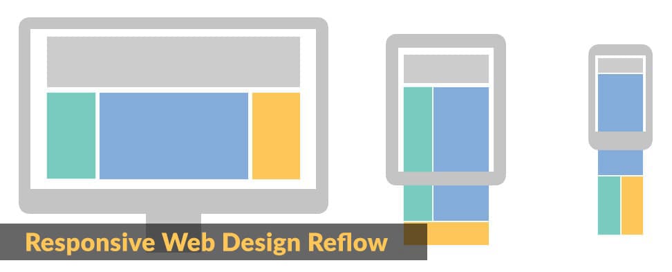
Responsive website design allows the reflowing of web page content to fit more devices than your standard desktop or laptop computer. With the usage of fluid behaviors, in lieu of absolute units in pixels, a properly structured web page will display correctly on devices smaller than computers. It will also stack content vertically. This will alleviate the need to scroll horizontally or pinch and zoom in order to read the content of the page.
With the massive increase in mobile device usage, having a responsive website is no longer considered best practice, but an absolute necessity!

Before responsive web design
Before responsive design, viewing a website on mobile devices could be more trouble than it was worth. Users expected a mobile experience as close to desktop as possible, but this wasn’t as easy as it sounded.
Horizontal scrolling
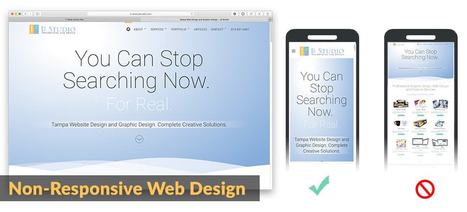
In the early days, many web design companies focused on a single screen resolution size; 680, 800 or 1024, for example. If you had a screen resolution of 800 X 600 and tried to view a website that was designed at 1024px your content was “cut off”. Consequently, you were forced to use the bottom scroll bar to scroll the page to the left in order to read the rest of the content that was cut off on the right side. Of course this also meant you had to use the scroll bar again to go back to the left and start over with the next sentence or paragraph. Hardly an ideal user experience.
This is what a mobile user’s experience was before the influx of responsive web design. Users were accustomed to scrolling up and down, of course, but left and right was just bad news and a bad experience. This was often caused by images that were not able to shrink with the page along with the text in order to fit the mobile users browser width.
Pinching and zooming
Not only did a user have to deal with scrolling left to right to view an entire web page, they also had to pinch and zoom in order to read the content. With the introduction of touch devices, pinching and zooming is a great feature - if we are talking about photos and graphics. Double-tapping or pinching and zooming to get a closer look at a product you wish to purchase on an e-commerce website or get a closeup view of your cousin’s first child is great.
When it comes to textual content or copy on a website, however, this is extremely counterproductive. When you pinch and zoom to read textual content you are once again forced to slide the page left and right in order to view compete sentences or paragraphs. Text should automatically resize and reflow to maintain legibility without the need for any additional hand gestures. People are used to holding their phones with one hand all the time and most have become adept at scrolling up and down with that same hand. Allowing a free hand to enjoy that fresh cup of coffee or whatever else they may be doing. But certainly not for engaging with their phone in order to properly view a website.
Separate mobile websites
As mentioned above, web designers targeted certain screen resolutions when creating websites. As a consequence the mobile user was neglected.
Necessity being the mother of invention the “mobile website” became an option. This was a duplicate of your desktop version, with the exception of the size, of course. Content was developed at a size that tried to accommodate a mobile experience. What this resulted in was two separate websites for your business or organization: one desktop and one mobile.
Because browsers had the ability to understand what device was requesting the website, it would serve the appropriate version of the site based on the device being used. If you were on a desktop you would get the desktop version. Conversely, mobile users would be served the mobile version. The URL of the website you were viewing could indicate which version you were served by including a prefix of m.mywebsite.com or mobile.mywebsite.com, for example.
Though mildly successful, this option was more of a band-aid than a solution. Web designers still had to target certain resolutions and try to consider the least common denominator when possible. But another issue soon came to fruition: if you needed any changes to your website, you now had to make them twice; once for desktop and once the the mobile version. While this may not be much of an issue for a small business website, enterprise websites containing thousands of pages were possibly looking at an awful lot of work.
How and why we arrived at Responsive Web Design
With all of the inconvenience some of the above strategies created, many said there had to be a better way. And there was: Media Queries.
- Media queries
- Media queries is a feature of CSS 3 allowing content rendering to adapt to different conditions such as screen resolution (e.g. mobile and desktop screen size). (Per wikipedia on Media Queries.).
Media Queries were initially introduced in 1994 by an individual named Håkon Wium Lie. But his efforts were not to be part of the initial CSS 1 specification. After a few years in development and trials, media queries were finally recommended by the W3C in 2012.
One of the first, and most popular since, CSS frameworks to utilize media queries was BootStrap. Originally released on August 19, 2011, BootStrap, and many others like it, have dominated the web design market since with extensive improvements and additions that make creating a responsive website easier and more efficient and functional than ever.
CSS frameworks contain the necessary CSS (Cascading Style Sheets) and JavaScript files and rules to render web pages in a responsive manner. Regardless of the device being used.

What if my website is not responsive?
If your business or organization does not have a responsive website design, you are running the risk of being left behind, literally. Here are some of the disadvantages of being kept back.
Direct affect on User Experience
Everything is about the User Experience (UX) on a website. If a user does not enjoy or, at the very least, have the ability easily view and navigate your website to achieve whatever goal they have in mind, you stand to lose them altogether.
If a user is has to pinch and zoom, or scroll horizontally, or use two hands to navigate your site, they will bounce out (called “bounce rate” in Google Analytics) of your website and seek a more pleasing and efficient user experience elsewhere.
You have only a few seconds to catch the user’s attention and if they are busy using their hands to simply get what they want, this is considered a poor user experience.
Direct affect on SERP rankings
The UX of a website has a direct affect on your rankings. Google and other search engines want to provide the best results possible to a user’s query. If the resulting web page has a poor UX or other poor design qualities, this will directly affect how you show up in the SERPs (Search Engine Results Pages).
Increased bounce rate
Google Analytics uses a metric called “Bounce Rate” as one of many determining factors when considering User Experience (UX) and, subsequently, ranking in SERPs . What is Bounce Rate? If a user visits a page on your website and does not engage at all, but instead hits the back button or closes the window, this is called a Bounce. They did not interact with your site in any way. They left the website completely. Google can see this.
How can this affect your ranking? Here is an example: Site A and Site B both show up in Google’s top 10 search results at #1 and #2 respectively for the query “Travel to Egypt”. Users who are clicking on Site A seem to be bouncing away from the site soon after visiting. Yet users to Site B remain on the site and engage with interior links and other page elements. After a while Google will see this and site A will no longer appear close to Site B in the search results. This is due to the fact that Google wants to provide the best solution to whatever a user is seeking. Obviously for users of Site A this was not happening because they were continually bouncing away. The users were obviously not finding the information they were seeking. Therefore it will be removed from the rankings despite having optimized for the search term used.
Time to design your website!
If you do not have a responsive website it is definitely time to have it redesigned. The information provided above should be enough of a reason to do so. We are all consumers at some level. It is a fair bet that you have experienced websites that are not responsive or offer a poor UX. What did you think of that website? What were the emotions you endured when trying to navigate such a website? These are questions you want to ask for your own users.
Why is responsive web design so important today?
The majority of websites being designed today should responsive to begin with. For those who opt for a Content Management System (CMS) such as Joomla! or Wordpress, any modern template or theme the designer uses will be responsive. As long as you are working with a professional web designer, this should not be a problem. As stated above, it is no longer considered “best practice”, but mandatory!
Google crawls as a mobile device
To add to the importance of responsive web design, Google is now crawling all websites on the internet as a mobile device. This means that the bots will expect to find a responsive version of your website. If it does not, you may be behind the eight ball in your market place.
All speed metrics are mobile first
Google and other search engines gather metrics in order to rank or rate a website’s user experience and other parameters. Page load time is one of them. It will not be enough to simply have a responsive web design any longer. You will need to make certain that the website loads in a respectable amount of time. Three seconds or less is ideal. Again, this has a direct bearing on the user experience and thus, your potential rankings.
Responsive design statistics
Statistics have shown, for years now, the growth of mobile usage on the internet. Mobile usage continues to grow with no end in sight.
When mobile overtook desktop usage
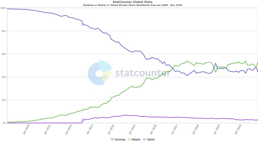
The use of mobile devices on the internet has grown exponentially over the past 10+ years. So much so that mobile users have now surpassed that of desktop users. The following graph illustrates the history of desktop users vs mobile users since 2009. Thanks to Statcounter.com for the information. You can clearly see the leveling of the playing field with respect to device marketshare on the internet.

Why mobile overtook desktop usage
Mobile phones and devices offer a great deal of convenience. Many people consider their mobile device a personal lifeline to the world. We have become so reliant upon these devices because we use them for virtually everything in our lives. Not just photos and social media, but for web browsing and shopping as well.
The idea of being able to surf the internet without being tethered to a 20 pound desktop computer became so appealing and so empowering to users. Device manufacturers and web designers had to deliver the best possible experience with the tools the users were engaging with to meet this demand.
Users were free to leave their homes, go shopping, ride the bus or airplane and still be able to surf the internet. Something that wasn’t possible with a desktop computer. Sure you could do it with a laptop but it isn’t always easy to unfold a laptop while holding the strap on the subway. With one hand free, you were allowed to roam the internet on your phone. Thanks to responsive web design.
In Conclusion
It is imperative for website owners to provide their users with an enjoyable and navigable website experience, especially when they are on their mobile devices. If you own a brick and mortar establishment, wouldn’t you want your customers to have the best possible experience while in your store or business? This should be the same goal for your website visitors.
If you are not customer-centric, if you don’t care about Google leaving you in the dust while your competitors are moving forward then forget everything you just read. However, if you are concerned with providing a great mobile experience for your website visitors, then consider hiring a professional web design company today to create a responsive website design for your business.